Joe & The Juice
Joe & The Juice

Joe & The Juice
Joe & The Juice

Elevating Brand Awareness for a Global Lifestyle Brand Through Bold Marketing Design
PROJECT INFORMATION
CLIENT
Joe & The Juice
Contribution
MaRKETING DESIGN
PLATFORM
DIGITAL & PRINT
TEAM - sHOREDITCH dESIGN
Madalina Loghin - DesignER
Jamain Gordon - DesignER
SEAN AYELTIGAH - design director
a global lifestyle brand
Joe and the Juice is a globally recognised lifestyle brand known for its vibrant juice bars and energetic, youthful atmosphere.
The brand emphasises fresh, healthy offerings paired with a distinctive, edgy visual identity that resonates with urban, health-conscious audiences.

(01)
ROLE & PROCESS
Crafting Visual Stories from Briefs
I created a range of visual assets to support new store openings and ongoing marketing campaigns. This included poster design, advertising materials, custom illustrations, and social media ads, all crafted to energise the brand’s presence and engage customers both in-store and online.
Worked directly from client briefs to understand campaign goals and target audience.
Conducted visual research to ensure designs aligned with current trends and the brand’s tone.
Developed mood boards and iterated design concepts based on internal feedback to refine messaging and visual impact.
Delivered finalised, polished assets for client approval and distribution.


(02)
DESIGN APPROACH
Balancing Boldness with Brand Integrity
Focused on creating bold, eye-catching visuals that stay true to Joe and the Juice’s vibrant brand identity. Balanced creativity with clarity to ensure messages were instantly impactful across physical and digital channels.
Key deliverables:
Store opening posters
— and in-store promotional materials
Social media ad campaign
— optimised for engagement
Custom illustrations
— to add personality and narrative to campaigns


(03)
REFLECTION
Strengthening Versatility in Design
This project enhanced my ability to efficiently translate client briefs into compelling marketing visuals while respecting established brand guidelines. It broadened my skill set beyond UX/UI design, demonstrating my versatility in delivering impactful graphic and campaign design work.


(04)
FROM SCREEN TO STREET
Design in the Wild
Seeing the work displayed at large scale reinforced the importance of clarity, bold typography, and quick visual impact in high-traffic spaces.


© ALL RIGHTS RESERVED
Madalina Loghin 2025
a global lifestyle brand
Joe and the Juice is a globally recognised lifestyle brand known for its vibrant juice bars and energetic, youthful atmosphere.
The brand emphasises fresh, healthy offerings paired with a distinctive, edgy visual identity that resonates with urban, health-conscious audiences.
(01)
ROLE & PROCESS
Crafting Visual Stories from Briefs
I created a range of visual assets to support new store openings and ongoing marketing campaigns. This included poster design, advertising materials, custom illustrations, and social media ads, all crafted to energise the brand’s presence and engage customers both in-store and online.
Worked directly from client briefs to understand campaign goals and target audience.
Conducted visual research to ensure designs aligned with current trends and the brand’s tone.
Developed mood boards and iterated design concepts based on internal feedback to refine messaging and visual impact.
Delivered finalised, polished assets for client approval and distribution.
(02)
DESIGN APPROACH
Balancing Boldness with Brand Integrity
Focused on creating bold, eye-catching visuals that stay true to Joe and the Juice’s vibrant brand identity. Balanced creativity with clarity to ensure messages were instantly impactful across physical and digital channels.
Key deliverables:
Store opening posters
— and in-store promotional materials
Social media ad campaign
— optimised for engagement
Custom illustrations
— to add personality and narrative to campaigns
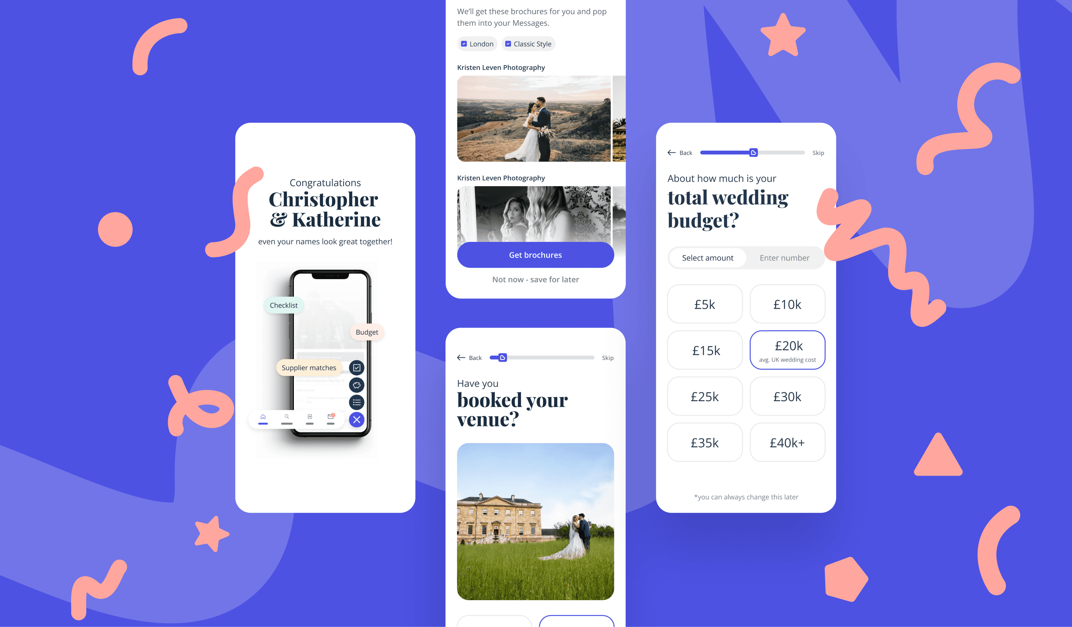
I played an end-to-end role in shaping the product experience, translating insights into high-impact design solutions in close collaboration with my team and stakeholders. Here’s an overview of my key responsibilities:
UX audits
Competitor benchmarking
Spot friction points and find strategic opportunities to differentiate BB from competitors.
Mapping user flows
Wireframing
UI exploration
Simplify complex journeys and explore scalable
interface solutions.
Prototyping in Figma
Regular in-person workshops
Accelerate alignment and decision-making with stakeholders.
User testing with engaged couples (first-time and returning users)
Validate solutions and refine based on real user feedback to reduce friction and confusion.
But the process wasn’t always linear. Stakeholder feedback loops, shifting priorities, and a mid-sprint brand refresh meant frequent pivots, open communication, and some tough calls along the way. I’ll touch on a few of these challenges below.
(03)
PROJECT CHALLENGES
Shifting priorities and conflicting stakeholder feedback
Feedback came from multiple Bridebook stakeholders, and their perspectives didn’t always align, requiring careful navigation and frequent iteration to find balanced solutions.
Mid-project brand refresh
The introduction of new primary and secondary colours and typography meant we had to rapidly realign the visual design through collaborative workshops.
User testing challenges
Some testing rounds didn’t produce actionable insights, prompting us to refine our research approach and retest to ensure valid feedback. Also, attendance issues sometimes limited feedback to only a few participants, which led stakeholders to prioritise changes based on business objectives rather than testing
data alone.
Positive outcome
Navigating these challenges strengthened team collaboration and ultimately led to a more polished, user-focused product experience.

(04)
SOLUTIONS
Solving the Venue to Supplier Puzzle
A Smarter, Simpler Onboarding Flow
To reduce drop-off and boost engagement, we reimagined the onboarding experience from the ground up. The new flow prioritises clarity, relevance, and momentum, asking only what’s necessary, when it matters most.
Key improvements
Streamlined sign-up with clearer steps and progressive disclosure
More personalised recommendations based on couples’ preferences
Visual cues and progress indicators to keep users moving forward
Impact
A more intuitive and personal experience that makes it easier for couples to get started and more likely to explore the supplier marketplace.
Timely Touchpoints That Drive Supplier Discovery
We introduced smarter, more contextual entry points to the supplier marketplace, based on where each couple was in their planning journey.
Key improvements
Designed tailored experiences for key moments (e.g. “venue booked” vs. “just getting started”)
Created smarter prompts and supplier cards that felt timely
and helpfulSurface suppliers based on real planning behaviours, not
just categories
Impact
By making supplier discovery feel more relevant and well-timed, we increased engagement with non-venue services, bringing users deeper into the product and closer to Bridebook’s business goals.
Navigation That Guides, Not Hides
We redesigned the navigation and homepage to make supplier discovery easier and more intuitive, moving beyond venues to highlight the full planning journey.
Key improvements
Simplified global navigation to reflect how couples plan
Homepage refresh with entry points into key categories (photographers, florists, etc.)
Visual clarity through better hierarchy, layout, and accessible
touch targets
Impact
By aligning the IA with real user goals, we made it easier for couples to find the right suppliers, boosting the marketplace’s visibility
and value.
A Modern Look to Match a Modern Product
We led a UI refresh to bring Bridebook’s interface in line with user expectations, introducing new colours, typography, and visual polish across the experience.
Key improvements
Introduced a warmer, more inviting primary colour and refined supporting palette
Updated typeface for better readability and a more
contemporary feelApplied the new visual direction across onboarding, homepage, and navigation flows
Impact
The refreshed look elevated the brand perception, improved visual clarity, and created a more cohesive experience, while still keeping usability and accessibility front and centre.
(03)
REFLECTION
Strengthening Versatility in Design
This project enhanced my ability to efficiently translate client briefs into compelling marketing visuals while respecting established brand guidelines. It broadened my skill set beyond UX/UI design, demonstrating my versatility in delivering impactful graphic and campaign design work.
Improved clarity and usability
Simplified navigation and onboarding flows made it easier for users to understand Bridebook’s offerings beyond venue booking, reducing confusion and cognitive load.
Enhanced first-time experience
A redesigned homepage and onboarding journey created a more welcoming, intuitive introduction, helping couples stay engaged early in their planning.
Stronger alignment with user goals
Personalised entry points into the supplier marketplace helped couples feel supported based on their unique stage in the wedding journey.
Positive feedback from internal stakeholders
Our design decisions fostered stronger alignment between product, design, and business teams, paving the way for future improvements in supplier discovery and retention.
(04)
FROM SCREEN TO STREET
Design in the Wild
Seeing the work displayed at large scale reinforced the importance of clarity, bold typography, and quick visual impact in high-traffic spaces.
(06)
TESTIMONIAL
Don’t Just Take My Word for It
Hamish Shephard - founder and CEO of Bridebook
“
Congrats on the launch of Navigation! It is now live! : ) A wonderful moment for BB. Thank you for all your tireless work on it. You were a truly integral part and wonderful to see it live. Excited for our couples to be and our competitors to be! And delighted our couples no longer think they have teleported to the 90s :) It will create joy for thousands and thousands of happy couples so well done and thank you!
(07)
FULL CASE STUDY
Want the full breakdown?
Full case study available on request.
PROJECT INFORMATION
CLIENT
Joe & The Juice
Year
2025
Contribution
MARKETING DESIGN
PLATFORM
DIGITAL & PRINT
TEAM - sHOREDITCH dESIGN
Madalina Loghin - DESIGNer
JAMAIN GORDON - DESIGNer
SEAN AYELTIGAH - design director
Elevating Brand Awareness for a Global Lifestyle Brand Through Bold Marketing Design
© ALL RIGHTS RESERVED
Madalina Loghin 2025

Menu
Joe & The Juice
Joe & The Juice

a global lifestyle brand
Joe and the Juice is a globally recognised lifestyle brand known for its vibrant juice bars and energetic, youthful atmosphere.
The brand emphasises fresh, healthy offerings paired with a distinctive, edgy visual identity that resonates with urban, health-conscious audiences.
(01)
ROLE & PROCESS
Crafting Visual Stories from Briefs
I created a range of visual assets to support new store openings and ongoing marketing campaigns. This included poster design, advertising materials, custom illustrations, and social media ads, all crafted to energise the brand’s presence and engage customers both in-store and online.
Worked directly from client briefs to understand campaign goals and target audience.
Conducted visual research to ensure designs aligned with current trends and the brand’s tone.
Developed mood boards and iterated design concepts based on internal feedback to refine messaging and visual impact.
Delivered finalised, polished assets for client approval and distribution.
(02)
DESIGN APPROACH
Balancing Boldness with Brand Integrity
Focused on creating bold, eye-catching visuals that stay true to Joe and the Juice’s vibrant brand identity. Balanced creativity with clarity to ensure messages were instantly impactful across physical and digital channels.
Key deliverables:
Store opening posters
— and in-store promotional materials
Social media ad campaign
— optimised for engagement
Custom illustrations
— to add personality and narrative to campaigns
I played an end-to-end role in shaping the product experience, translating insights into high-impact design solutions in close collaboration with my team and stakeholders. Here’s an overview of my key responsibilities:
UX audits
Competitor benchmarking
Spot friction points and find strategic opportunities to differentiate BB from competitors.
Mapping user flows
Wireframing
UI exploration
Simplify complex journeys and explore scalable interface solutions.
Prototyping in Figma
Regular in-person workshops
Accelerate alignment and decision-making with stakeholders.
User testing with engaged couples (first-time and returning users)
Validate solutions and refine based on real user feedback to reduce friction and confusion.
But the process wasn’t always linear. Stakeholder feedback loops, shifting priorities, and a mid-sprint brand refresh meant frequent pivots, open communication, and some tough calls along the way. I’ll touch on a few of these challenges below.
(03)
PROJECT CHALLENGES
Shifting priorities and conflicting stakeholder feedback
Feedback came from multiple Bridebook stakeholders, and their perspectives didn’t always align, requiring careful navigation and frequent iteration to find balanced solutions.
Mid-project brand refresh
The introduction of new primary and secondary colours and typography meant we had to rapidly realign the visual design through collaborative workshops.
User testing challenges
Some testing rounds didn’t produce actionable insights, prompting us to refine our research approach and retest to ensure valid feedback. Also, attendance issues sometimes limited feedback to only a few participants, which led stakeholders to prioritise changes based on business objectives rather than testing data alone.
Positive outcome
Navigating these challenges strengthened team collaboration and ultimately led to a more polished, user-focused product experience.
(04)
SOLUTIONS
Solving the Venue to Supplier Puzzle
A Smarter, Simpler Onboarding Flow
To reduce drop-off and boost engagement, we reimagined the onboarding experience from the ground up. The new flow prioritises clarity, relevance, and momentum, asking only what’s necessary, when it matters most.
Key improvements
Streamlined sign-up with clearer steps and progressive disclosure
More personalised recommendations based on couples’ preferences
Visual cues and progress indicators to keep users moving forward
Impact
A more intuitive and personal experience that makes it easier for couples to get started and more likely to explore the supplier marketplace.
Timely Touchpoints That Drive Supplier Discovery
We introduced smarter, more contextual entry points to the supplier marketplace, based on where each couple was in their planning journey.
Key improvements
Designed tailored experiences for key moments (e.g. “venue booked” vs. “just getting started”)
Created smarter prompts and supplier cards that felt timely and helpful
Surface suppliers based on real planning behaviours, not just categories
Impact
By making supplier discovery feel more relevant and well-timed, we increased engagement with non-venue services, bringing users deeper into the product and closer to Bridebook’s business goals.
Navigation That Guides, Not Hides
We redesigned the navigation and homepage to make supplier discovery easier and more intuitive, moving beyond venues to highlight the full planning journey.
Key improvements
Simplified global navigation to reflect how couples plan
Homepage refresh with entry points into key categories (photographers, florists, etc.)
Visual clarity through better hierarchy, layout, and accessible touch targets
Impact
By aligning the IA with real user goals, we made it easier for couples to find the right suppliers, boosting the marketplace’s visibility and value.
A Modern Look to Match a Modern Product
We led a UI refresh to bring Bridebook’s interface in line with user expectations, introducing new colours, typography, and visual polish across the experience.
Key improvements
Introduced a warmer, more inviting primary colour and refined supporting palette
Updated typeface for better readability and a more contemporary feel
Applied the new visual direction across onboarding, homepage, and navigation flows
Impact
The refreshed look elevated the brand perception, improved visual clarity, and created a more cohesive experience, while still keeping usability and accessibility front and centre.
(03)
RELFLECTION
Strengthening Versatility in Design
This project enhanced my ability to efficiently translate client briefs into compelling marketing visuals while respecting established brand guidelines. It broadened my skill set beyond UX/UI design, demonstrating my versatility in delivering impactful graphic and campaign design work.
Improved clarity and usability
Simplified navigation and onboarding flows made it easier for users to understand Bridebook’s offerings beyond venue booking, reducing confusion and cognitive load.
Enhanced first-time experience
A redesigned homepage and onboarding journey created a more welcoming, intuitive introduction, helping couples stay engaged early in their planning.
Stronger alignment with user goals
Personalised entry points into the supplier marketplace helped couples feel supported based on their unique stage in the wedding journey.
Positive feedback from internal stakeholders
Our design decisions fostered stronger alignment between product, design, and business teams, paving the way for future improvements in supplier discovery and retention.
(04)
FROM SCREEN TO STREET
Design in the Wild
Seeing the work displayed at large scale reinforced the importance of clarity, bold typography, and quick visual impact in high-traffic spaces.
(06)
TESTIMONIAL
Don’t Just Take My Word for It
Hamish Shephard - founder and CEO of Bridebook
“
Congrats on the launch of Navigation! It is now live! : ) A wonderful moment for BB. Thank you for all your tireless work on it. You were a truly integral part and wonderful to see it live. Excited for our couples to be and our competitors to be! And delighted our couples no longer think they have teleported to the 90s :) It will create joy for thousands and thousands of happy couples so well done and thank you!
(07)
FULL CASE STUDY
Want the full breakdown?
Full case study available on request.
More work
PROJECT INFORMATION
Year
2025
CLIENT
Joe & The Juice
Contribution
MARKETING DESIGN
PLATFORM
DIGITAL & PRINT
TEAM - sHOREDITCH dESIGN
Madalina Loghin - DESIGNer
JAMAIN GORDON - DESIGNer
SEAN AYELTIGAH - design director
Elevating Brand Awareness for a Global Lifestyle Brand Through Bold Marketing Design
JOE & THE JUICE
JOE & THE JUICE
© ALL RIGHTS RESERVED
Madalina Loghin 2025