BRIDEBOOK
BRIDEBOOK

BRIDEBOOK
BRIDEBOOK

Driving long-term engagement for 1.9M couples
PROJECT INFORMATION
CLIENT
BRIDEBOOK
Contribution
UX DESIGN
VISUAL DESIGN
PLATFORM
MOBILE
desktop
TEAM - sHOREDITCH dESIGN
Madalina Loghin - UX/UI
Dylan MacKay - sENIOR UX/UI
Emma JAMES - pROJECT maNAGER
Andrew Burton - Creative Director
ALL-IN-ONE WEDDING PLANNING
Bridebook is a wedding planning app used by 1.9 million engaged couples to discover venues, book suppliers, and manage their wedding end-to-end.
Originally focused on venue discovery, the product has since expanded into a full wedding planning ecosystem.

(01)
THE PROBLEM
The Onboarding Gap That Cost Engagement
As Bridebook expanded beyond venues into a broader supplier marketplace (photographers, florists, caterers) a critical issue emerged.
Many couples disengaged after securing a venue and never progressed into supplier discovery.
Internally, this was known as the “Venue to Supplier (VTS)” challenge, focused on two core goals:
VTS Retention
Increase user retention beyond venue booking
VTS Conversion
Drive meaningful engagement with suppliers
(02)
MY ROLE
Turning Insight into Impact
As a UX/UI Designer, I worked alongside a senior designer, PM, and cross-functional stakeholders to address Bridebook’s shift from a venue-centric product to a broader “Venue to Supplier” (VTS) planning journey.
I focused on improving early engagement and making supplier discovery clearer and more timely.
I was responsible for key parts of the UX groundwork and early product direction, contributing to several experience improvements:
Improved
app navigation to support clearer supplier discovery.
Simplified
the onboarding flow to reduce friction and early drop-off.
Contributed
to the evolving rebrand through UI exploration.
Designed
personalised entry points into the supplier marketplace.
My contribution spanned research, journey definition, and delivery in the following areas:
UX audits
Competitor benchmarking
Identified friction across onboarding and navigation, synthesised research insights, and surfaced key opportunities.
Mapping user flows
Wireframing
UI exploration
Defined early-journey flows and explored UX-to-UI directions to shape core screens.
Prototyping
Stakeholder collaboration
Built prototypes for alignment, workshops and testing, helping accelerate decisions and unify direction across teams.
Rebrand contribution
UI rollout
Contributed colour and typography proposals and applied the selected direction across key screens.
User testing
Refinement
Ran a live usability session and collaborated on further testing, refining key flows before delivery.


(03)
COLLABORATION & TRADEOFFS
Shaping Direction Together
Aligning on strategy
The project unfolded while Bridebook was redefining its supplier strategy and expanding the planning journey. As insights emerged, I aligned with the PM and stakeholders on what would deliver the most value early.
Balancing tradeoffs
Some supplier-related decisions sat outside the product’s control, and onboarding needed to remain lightweight to avoid friction. As priorities shifted, we narrowed scope and focused on the highest-impact changes to navigation and early engagement.
Working within real constraints
Limited user access meant relying on existing research, qualitative testing and internal reviews to guide decisions. We chose a flexible UI direction that aligned with the evolving rebrand while improving clarity and hierarchy.
The process wasn’t linear. Shifting priorities, stakeholder feedback loops, and a
mid-sprint brand refresh required adaptability and clear communication.
(04)
PROJECT CHALLENGES
The Messy Middle
Shifting priorities and conflicting stakeholder feedback
Feedback came from multiple stakeholders with competing priorities. I iterated frequently and aligned on solutions that balanced user clarity with business goals.
Mid-project brand refresh
A mid-project brand refresh introduced new colours and typography, requiring rapid realignment of the visual system through collaborative workshops.
User testing challenges
Some testing rounds produced limited insights, prompting us to refine our approach and retest key flows. When participant numbers were lower, we combined user feedback with existing research and business priorities to guide decisions.
Positive outcome
These constraints strengthened cross-functional alignment and led to a more focused, user-led early journey.
(05)
GETTING CLARITY
What I Needed to Understand
How couples actually move through planning versus the idealised flow.
Where overwhelm caused people to stall or lose momentum.
Which actions genuinely drove progress, and which added noise.
How much detail helped decision-making versus creating friction.

(06)
SOLUTIONS
Solving the Venue to Supplier Puzzle
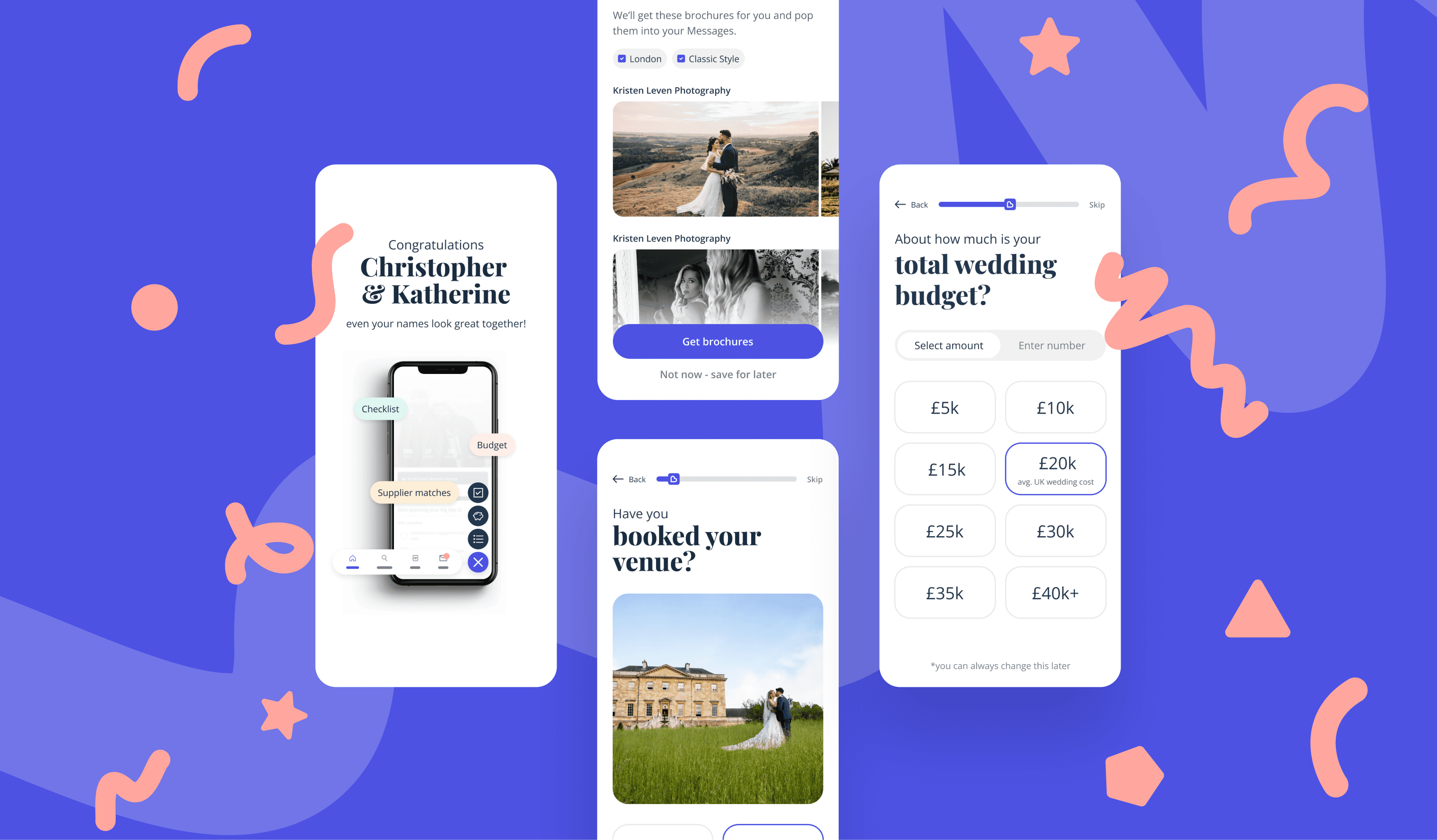
A Smarter, Simpler Onboarding Flow
To reduce early drop-off and guide couples into planning with clarity, the onboarding was simplified and contextual supplier touchpoints introduced at the right moments.
Decision focus
Whether to increase personalisation upfront or reduce friction by keeping onboarding lean while still surfacing relevant suppliers.
Key improvements
Streamlined sign-up with clearer steps and progressive disclosure
Personalised recommendations based on the planning stage and preferences
Timely prompts and supplier cards that feel relevant
Visual cues and progress indicators to keep momentum
Decision rationale
A heavier onboarding could have improved personalisation but risked higher drop-off. The decision was to keep it lean and introduce flexible supplier touchpoints while the strategy was still evolving.
Limited testing and an active rebrand meant we relied on existing research and adaptable UI patterns rather than finalised visuals.
Impact
Improved early progression into supplier discovery while reinforcing a lean onboarding approach.
Navigation That Guides, Not Hides
We redesigned the navigation and homepage to make supplier discovery clearer and more intuitive, shifting focus beyond venues to the full planning journey.
Decision focus
How far we could reshape navigation to reflect real planning behaviour without fully overhauling the IA under engineering constraints.
Key improvements
Simplified global navigation to reflect how couples plan
Refreshed the homepage with clear entry points into key supplier categories
Improved visual hierarchy, layout, and touch targets for clarity and accessibility
Decision rationale
Engineering constraints meant a full IA overhaul wasn’t feasible. We focused on simplifying the highest-impact areas while working within the existing structure.
Impact
Increased visibility of supplier categories and made early exploration feel more structured and intentional.
A Modern Look to Match a Modern Product
We refreshed the UI to bring Bridebook’s interface in line with evolving user expectations, introducing updated colour, typography, and visual cohesion across key flows.
Decision focus
We needed to modernise the interface without disrupting familiarity or usability across core planning flows.
Key improvements
Introduced a warmer primary colour and refined supporting palette
Updated typography for improved readability and hierarchy
Rolled out the visual direction across onboarding, homepage, and navigation
Decision rationale
Updates needed to feel like an evolution, not a reinvention. We introduced changes progressively across high-impact areas to avoid disrupting core flows.
Impact
Delivered a more cohesive and modern interface while preserving usability across core flows.


(07)
OUTCOMES
The Aftermath: What We Improved
Post-launch metrics weren't available, but consistent signal (repeat client engagement, the design ran live for nearly three years before they did a refresh earlier this year, and a clear shift in app store reviews) pointed to real business outcomes:
Improved onboarding-to-activation conversion
Reduced early drop-off by simplifying onboarding and navigation, getting more couples to supplier discovery faster with less friction.
Reduced time-to-value for new users
A clearer homepage and onboarding structure shortened the path from first session to first meaningful action, improving early activation.
Increased cross-category supplier engagement
Personalised entry points opened up discovery beyond venues, driving engagement across supplier categories that were previously underperforming.
Aligned teams around a shared growth priority
Gave product, design, and business a common strategic focus on supplier engagement, reducing competing priorities and speeding up decision-making.


(08)
TESTIMONIAL
Don’t Just Take My Word For It
Hamish Shephard - founder and CEO of Bridebook
“
Congrats on the launch of Navigation! It is now live! : ) A wonderful moment for BB. Thank you for all your tireless work on it. You were a truly integral part and wonderful to see it live. Excited for our couples to be and our competitors to be! And delighted our couples no longer think they have teleported to the 90s :) It will create joy for thousands and thousands of happy couples so well done and thank you!


© ALL RIGHTS RESERVED
Madalina Loghin 2025
ALL-IN-ONE WEDDING PLANNING
Bridebook is a wedding planning app used by 1.9 million engaged couples to discover venues, book suppliers, and manage their wedding end-to-end.
Originally focused on venue discovery, the product has since expanded into a full wedding planning ecosystem.
(01)
THE PROBLEM
The Onboarding Gap That Cost Engagement
As Bridebook expanded beyond venues into a broader supplier marketplace (photographers, florists, caterers) a critical issue emerged.
Many couples disengaged after securing a venue and never progressed into supplier discovery.
Internally, this was known as the “Venue to Supplier (VTS)” challenge, focused on two core goals:
VTS Retention
Increase user retention beyond venue booking
VTS Conversion
Drive meaningful engagement with suppliers
(02)
MY ROLE
Turning Insight into Impact
As a UX/UI Designer, I worked alongside a senior designer, PM, and cross-functional stakeholders to address Bridebook’s shift from a venue-centric product to a broader “Venue to Supplier” (VTS) planning journey.
I focused on improving early engagement and making supplier discovery clearer and more timely.
I was responsible for key parts of the UX groundwork and early product direction, contributing to several experience improvements:
Improved
app navigation to support clearer supplier discovery.
Simplified
the onboarding flow to reduce friction and early drop-off.
Contributed
to the evolving rebrand through UI exploration.
Designed
personalised entry points into the supplier marketplace.
My contribution spanned research, journey definition, and delivery in the following areas:
UX audits
Competitor benchmarking
Identified friction across onboarding and navigation, synthesised research insights, and surfaced key opportunities.
Mapping user flows
Wireframing
UI exploration
Defined early-journey flows and explored UX-to-UI directions to shape core screens.
Prototyping
Stakeholder collaboration
Built prototypes for alignment, workshops and testing, helping accelerate decisions and unify direction across teams.
Rebrand contribution
UI rollout
Contributed colour and typography proposals and applied the selected direction across key screens.
User testing
Refinement
Ran a live usability session and collaborated on further testing, refining key flows before delivery.
(04)
PROJECT CHALLENGES
Shifting priorities and conflicting stakeholder feedback
Feedback came from multiple stakeholders with competing priorities. I iterated frequently and aligned on solutions that balanced user clarity with business goals.
Mid-project brand refresh
A mid-project brand refresh introduced new colours and typography, requiring rapid realignment of the visual system through collaborative workshops.
User testing challenges
Some testing rounds produced limited insights, prompting us to refine our approach and retest key flows. When participant numbers were lower, we combined user feedback with existing research and business priorities to guide decisions.
Positive outcome
These constraints strengthened cross-functional alignment and led to a more focused, user-led early journey.
The Messy Middle
(06)
SOLUTIONS
A Smarter, Simpler Onboarding Flow
To reduce early drop-off and guide couples into planning with clarity, the onboarding was simplified and contextual supplier touchpoints introduced at the right moments.
Decision focus
Whether to increase personalisation upfront or reduce friction by keeping onboarding lean while still surfacing relevant suppliers.
Key improvements
Streamlined sign-up with clearer steps and progressive disclosure
Personalised recommendations based on the planning stage and preferences
Timely prompts and supplier cards that feel relevant
Visual cues and progress indicators to keep momentum
Decision rationale
A heavier onboarding could have improved personalisation but risked higher drop-off. The decision was to keep it lean and introduce flexible supplier touchpoints while the strategy was still evolving.
Limited testing and an active rebrand meant we relied on existing research and adaptable UI patterns rather than finalised visuals.
Impact
Improved early progression into supplier discovery while reinforcing a lean onboarding approach.
Navigation That Guides, Not Hides
We redesigned the navigation and homepage to make supplier discovery clearer and more intuitive, shifting focus beyond venues to the full planning journey.
Decision focus
How far we could reshape navigation to reflect real planning behaviour without fully overhauling the IA under engineering constraints.
Key improvements
Simplified global navigation to reflect how couples plan
Refreshed the homepage with clear entry points into key supplier categories
Improved visual hierarchy, layout, and touch targets for clarity and accessibility
Decision rationale
Engineering constraints meant a full IA overhaul wasn’t feasible. We focused on simplifying the highest-impact areas while working within the existing structure.
Impact
Increased visibility of supplier categories and made early exploration feel more structured and intentional.and value.
A Modern Look to Match a Modern Product
We refreshed the UI to bring Bridebook’s interface in line with evolving user expectations, introducing updated colour, typography, and visual cohesion across key flows.
Decision focus
We needed to modernise the interface without disrupting familiarity or usability across core planning flows.
Key improvements
Introduced a warmer primary colour and refined supporting palette
Updated typography for improved readability and hierarchy
Rolled out the visual direction across onboarding, homepage, and navigation
Decision rationale
Updates needed to feel like an evolution, not a reinvention. We introduced changes progressively across high-impact areas to avoid disrupting core flows.
Impact
Delivered a more cohesive and modern interface while preserving usability across core flows.
Solving the Venue to Supplier Puzzle
(03)
COLLABORATION & TRADEOFFS
Aligning on strategy
The project unfolded while Bridebook was redefining its supplier strategy and expanding the planning journey. As insights emerged, I aligned with the PM and stakeholders on what would deliver the most value early.
Balancing tradeoffs
Some supplier-related decisions sat outside the product’s control, and onboarding needed to remain lightweight to avoid friction. As priorities shifted, we narrowed scope and focused on the highest-impact changes to navigation and early engagement.
Working within real constraints
Limited user access meant relying on existing research, qualitative testing and internal reviews to guide decisions. We chose a flexible UI direction that aligned with the evolving rebrand while improving clarity and hierarchy.
Shaping Direction Together
The process wasn’t linear. Shifting priorities, stakeholder feedback loops, and a mid-sprint brand refresh required adaptability and clear communication.
(05)
GETTING CLARITY
How couples actually move through planning versus the idealised flow.
What I Needed to Understand
Where overwhelm caused people to stall or lose momentum.
Which actions genuinely drove progress, and which added noise.
How much detail helped decision-making versus creating friction.
(07)
OUTCOMES
The Aftermath: What We Improved
Post-launch metrics weren't available, but consistent signal (repeat client engagement, the design ran live for nearly three years before they did a refresh earlier this year, and a clear shift in app store reviews) pointed to real business outcomes:
Improved onboarding-to-activation conversion
Reduced early drop-off by simplifying onboarding and navigation, getting more couples to supplier discovery faster with less friction.
Reduced time-to-value for new users
A clearer homepage and onboarding structure shortened the path from first session to first meaningful action, improving early activation.
Increased cross-category supplier engagement
Personalised entry points opened up discovery beyond venues, driving engagement across supplier categories that were previously underperforming.
Aligned teams around a shared growth priority
Gave product, design, and business a common strategic focus on supplier engagement, reducing competing priorities and speeding up decision-making.
(08)
TESTIMONIAL
Don’t Just Take My Word for It
Hamish Shephard - founder and CEO of Bridebook
“
Congrats on the launch of Navigation! It is now live! : ) A wonderful moment for BB. Thank you for all your tireless work on it. You were a truly integral part and wonderful to see it live. Excited for our couples to be and our competitors to be! And delighted our couples no longer think they have teleported to the 90s :) It will create joy for thousands and thousands of happy couples so well done and thank you!
(09)
FULL CASE STUDY
Want the full breakdown?
Full case study available on request.
PROJECT INFORMATION
CLIENT
BRIDEBOOK
Year
2023
Contribution
UX DESIGN
VISUAL DESIGN
PLATFORM
MOBILE
desktop
TEAM - sHOREDITCH dESIGN
Madalina Loghin - UX/UI
Dylan MacKay - sENIOR UX/UI
Emma JAMES - pROJECT maNAGER
Andrew Burton - Creative Director
Driving long-term engagement for 1.9M couples


© ALL RIGHTS RESERVED
Madalina Loghin 2025

Menu
BRIDEBOOK
BRIDEBOOK
ALL-IN-ONE WEDDING PLANNING
Bridebook is a wedding planning app used by 1.9 million engaged couples to discover venues, book suppliers, and manage their wedding end-to-end.
Originally focused on venue discovery, the product has since expanded into a full wedding planning ecosystem.
(01)
THE PROBLEM
The Onboarding Gap That Cost Engagement
As Bridebook expanded beyond venues into a broader supplier marketplace (photographers, florists, caterers) a critical issue emerged.
Many couples disengaged after securing a venue and never progressed into supplier discovery.
Internally, this was known as the “Venue to Supplier (VTS)” challenge, focused on two core goals:
VTS Retention
Increase user retention beyond venue booking
VTS Conversion
Drive meaningful engagement with suppliers
(02)
MY ROLE
Turning Insight into Impact
As a UX/UI Designer, I worked alongside a senior designer, PM, and cross-functional stakeholders to address Bridebook’s shift from a venue-centric product to a broader “Venue to Supplier” (VTS) planning journey.
I focused on improving early engagement and making supplier discovery clearer and more timely.
I was responsible for key parts of the UX groundwork and early product direction, contributing to several experience improvements:
Improved
app navigation to support clearer supplier discovery.
Simplified
the onboarding flow to reduce friction and early drop-off.
Contributed
to the evolving rebrand through UI exploration.
Designed
personalised entry points into the supplier marketplace.
My contribution spanned research, journey definition, and delivery in the following areas:
UX audits
Competitor benchmarking
Identified friction across onboarding and navigation, synthesised research insights, and surfaced key opportunities.
Mapping user flows
Wireframing
UI exploration
Defined early-journey flows and explored UX-to-UI directions to shape core screens.
Prototyping
Stakeholder collaboration
Built prototypes for alignment, workshops and testing, helping accelerate decisions and unify direction across teams.
Rebrand contribution
UI rollout
Contributed colour and typography proposals and applied the selected direction across key screens.
User testing
Refinement
Ran a live usability session and collaborated on further testing, refining key flows before delivery.
The process wasn’t linear. Shifting priorities, stakeholder feedback loops, and a mid-sprint brand refresh required adaptability and clear communication.
(04)
PROJECT CHALLENGES
Shifting priorities and conflicting stakeholder feedback
Feedback came from multiple stakeholders with competing priorities. I iterated frequently and aligned on solutions that balanced user clarity with business goals.
Mid-project brand refresh
A mid-project brand refresh introduced new colours and typography, requiring rapid realignment of the visual system through collaborative workshops.
User testing challenges
Some testing rounds produced limited insights, prompting us to refine our approach and retest key flows. When participant numbers were lower, we combined user feedback with existing research and business priorities to guide decisions.
Positive outcome
These constraints strengthened cross-functional alignment and led to a more focused, user-led early journey.
The Messy Middle
(03)
COLLABORATION & TRADEOFFS
Aligning on strategy
The project unfolded while Bridebook was redefining its supplier strategy and expanding the planning journey. As insights emerged, I aligned with the PM and stakeholders on what would deliver the most value early.
Balancing tradeoffs
Some supplier-related decisions sat outside the product’s control, and onboarding needed to remain lightweight to avoid friction. As priorities shifted, we narrowed scope and focused on the highest-impact changes to navigation and early engagement.
Working within real constraints
Limited user access meant relying on existing research, qualitative testing and internal reviews to guide decisions. We chose a flexible UI direction that aligned with the evolving rebrand while improving clarity and hierarchy.
Shaping Direction Together
(05)
GETTING CLARITY
How couples actually move through planning versus the idealised flow.
What I Needed to Understand
Where overwhelm caused people to stall or lose momentum.
Which actions genuinely drove progress, and which added noise.
How much detail helped decision-making versus creating friction.
(06)
SOLUTIONS
Solving the Venue to Supplier Puzzle
A Smarter, Simpler Onboarding Flow
To reduce early drop-off and guide couples into planning with clarity, the onboarding was simplified and contextual supplier touchpoints introduced at the right moments.
Decision focus
Whether to increase personalisation upfront or reduce friction by keeping onboarding lean while still surfacing relevant suppliers.
Key improvements
Streamlined sign-up with clearer steps and progressive disclosure
Personalised recommendations based on the planning stage and preferences
Timely prompts and supplier cards that feel relevant
Visual cues and progress indicators to keep momentum
Impact
Improved early progression into supplier discovery while reinforcing a lean onboarding approach.
Decision rationale
A heavier onboarding could have improved personalisation but risked higher drop-off. The decision was to keep it lean and introduce flexible supplier touchpoints while the strategy was still evolving.
Limited testing and an active rebrand meant we relied on existing research and adaptable UI patterns rather than finalised visuals.
Timely Touchpoints That Drive Supplier Discovery
We introduced smarter, more contextual entry points to the supplier marketplace, based on where each couple was in their planning journey.
Key improvements
Designed tailored experiences for key moments (e.g. “venue booked” vs. “just getting started”)
Created smarter prompts and supplier cards that felt timely and helpful
Surface suppliers based on real planning behaviours, not just categories
Impact
By making supplier discovery feel more relevant and well-timed, we increased engagement with non-venue services, bringing users deeper into the product and closer to Bridebook’s business goals.
Navigation That Guides, Not Hides
We redesigned the navigation and homepage to make supplier discovery clearer and more intuitive, shifting focus beyond venues to the full planning journey.
Decision focus
How far we could reshape navigation to reflect real planning behaviour without fully overhauling the IA under engineering constraints.
Key improvements
Simplified global navigation to reflect how couples plan
Refreshed the homepage with clear entry points into key supplier categories
Improved visual hierarchy, layout, and touch targets for clarity and accessibility
Impact
Increased visibility of supplier categories and made early exploration feel more structured and intentional.
Decision rationale
Engineering constraints meant a full IA overhaul wasn’t feasible. We focused on simplifying the highest-impact areas while working within the existing structure.
A Modern Look to Match a Modern Product
We refreshed the UI to bring Bridebook’s interface in line with evolving user expectations, introducing updated colour, typography, and visual cohesion across key flows.
Decision focus
We needed to modernise the interface without disrupting familiarity or usability across core planning flows.
Key improvements
Introduced a warmer primary colour and refined supporting palette
Updated typography for improved readability and hierarchy
Rolled out the visual direction across onboarding, homepage, and navigation
Impact
Delivered a more cohesive and modern interface while preserving usability across core flows.
Decision rationale
Updates needed to feel like an evolution, not a reinvention. We introduced changes progressively across high-impact areas to avoid disrupting core flows.
(07)
OUTCOMES
The Aftermath: What We Improved
Post-launch metrics weren't available, but consistent signal (repeat client engagement, the design ran live for nearly three years before they did a refresh earlier this year, and a clear shift in app store reviews) pointed to real business outcomes:
Improved onboarding-to-activation conversion
Reduced early drop-off by simplifying onboarding and navigation, getting more couples to supplier discovery faster with less friction.
Reduced time-to-value for new users
A clearer homepage and onboarding structure shortened the path from first session to first meaningful action, improving early activation.
Increased cross-category supplier engagement
Personalised entry points opened up discovery beyond venues, driving engagement across supplier categories that were previously underperforming.
Aligned teams around a shared growth priority
Gave product, design, and business a common strategic focus on supplier engagement, reducing competing priorities and speeding up decision-making.
(08)
TESTIMONIAL
Don’t Just Take My Word For It
Hamish Shephard - founder and CEO of Bridebook
“
Congrats on the launch of Navigation! It is now live! : ) A wonderful moment for BB. Thank you for all your tireless work on it. You were a truly integral part and wonderful to see it live. Excited for our couples to be and our competitors to be! And delighted our couples no longer think they have teleported to the 90s :) It will create joy for thousands and thousands of happy couples so well done and thank you!
(09)
FULL CASE STUDY
Want the full breakdown?
Full case study available on request.
More work
PROJECT INFORMATION
Year
2023
CLIENT
BRIDEBOOK
Contribution
UX DESIGN
VISUAL DESIGN
PLATFORM
MOBILE
desktop
TEAM - sHOREDITCH dESIGN
Madalina Loghin - UX/UI
Dylan MacKay - sENIOR UX/UI
Emma JAMES - pROJECT maNAGER
Andrew Burton - Creative Director
Driving long-term engagement for 1.9M couples
BRIDEBOOK
BRIDEBOOK
© ALL RIGHTS RESERVED
Madalina Loghin 2025