CRED
CRED

CRED
CRED

Bringing structure to a multi-product sports platform
PROJECT INFORMATION
CLIENT
CRED
Contribution
UI/VISUAL DESIGN
Information Architecture
PLATFORM
DESKTOP
MOBILE
TEAM - sHOREDITCH dESIGN
Madalina Loghin - Design lead
Dylan MacKay - sENIOR UX/UI
SPORTS DATA INTELLIGENCE
CRED is a data intelligence layer for sports, delivering revenue and driving efficiency on and off the field.
It began with one product (player financing) and grew into three, each for a different audience. The site still spoke for the old one.

(01)
THE PROBLEM
The Website Was Still Selling One Thing
CRED's old "homepage" was really a player-financing pitch, with a club and an about page bolted on. It read like a company with
one product.
That wasn't true anymore. CRED now had three: Player Financing, Onfield, and Commercial, and Commercial alone served two opposite audiences. The brief put it plainly: "We've evolved as a company and need to update our website to reflect this."
Two things had to change:

One front door for 3 products
An overview, not a single pitch.

One message per audience
Especially in Commercial, where rights holders and brands want opposite things.
(02)
MY ROLE
Owning the Whole Picture
I led the design end-to-end. The visible work was the interface, but the real work sat underneath it. Before any UI, I reworked how the whole offer was organised: what lived where, and who each page was actually speaking to.
Mapped
the full offer into a clear information architecture.
Defined
who each page speaks to, and what it leads with.
Solved
the Commercial rights-holder vs brand split.
Modernised
the UI inside the existing brand


(03)
CONSTRAINTS & TRADEOFFS
Designing Inside the Lines
Most of the calls came from working inside real limits.
Build into a half-finished system
Several pages were already designed and locked, and new product pages were briefed to follow the shape of the existing ones. The work had to extend a pattern and slot in seamlessly, not redesign what was already there.
Keep the brand
The existing identity still suited the company. A refresh, not a rebrand.
Turn detail into an overview
The brief supplied dense, feature-heavy product copy but asked the homepage to give a simple, generic overview of all three products. Shaping that into something scannable was part of the job.
Design for what's next
Layouts had to survive European languages and leave room to add case studies later, without another redesign.
(04)
GETTING CLARITY
What I Needed to Get Right
Before designing, the questions that shaped the work were less about screens and more about audiences and structure. The second and third questions drove everything that followed.
Who actually lands on each page, and what do they need to see in the first five seconds?
What does a rights holder care about that a brand doesn't, and the other way round?
Which product earns the homepage, and which can wait a click?
How much could change before the brand stopped feeling like itself?

(05)
SOLUTIONS
Untangling the Offer
The Commercial split
Commercial served two audiences with opposite relationships to the same data: rights holders (clubs, leagues, federations, players) who own and sell sporting attention, and brands who want to buy it. Same product, opposite jobs. The brief flagged it as unsolved: "I'm not sure the best way to do this."
Decision focus
Two separate pages, one combined page, or one page that adapts to who you are.
Key improvements
A "for right holders/for brands" toggle at the top of a single Commercial page. Same structural shell: who it's for → what we offer → features, with the content swapped per audience.
Decision rationale
Two pages would have split Commercial into two smaller-feeling products; one page for both would have read generic, clear to neither. The toggle keeps it whole and shows each audience only what's theirs.
Impact
One product, two clear doors, and a pattern that scales to a third audience without a redesign.
One system, one front door
Three technical, unfamiliar products needed to be readable fast.
Key improvements
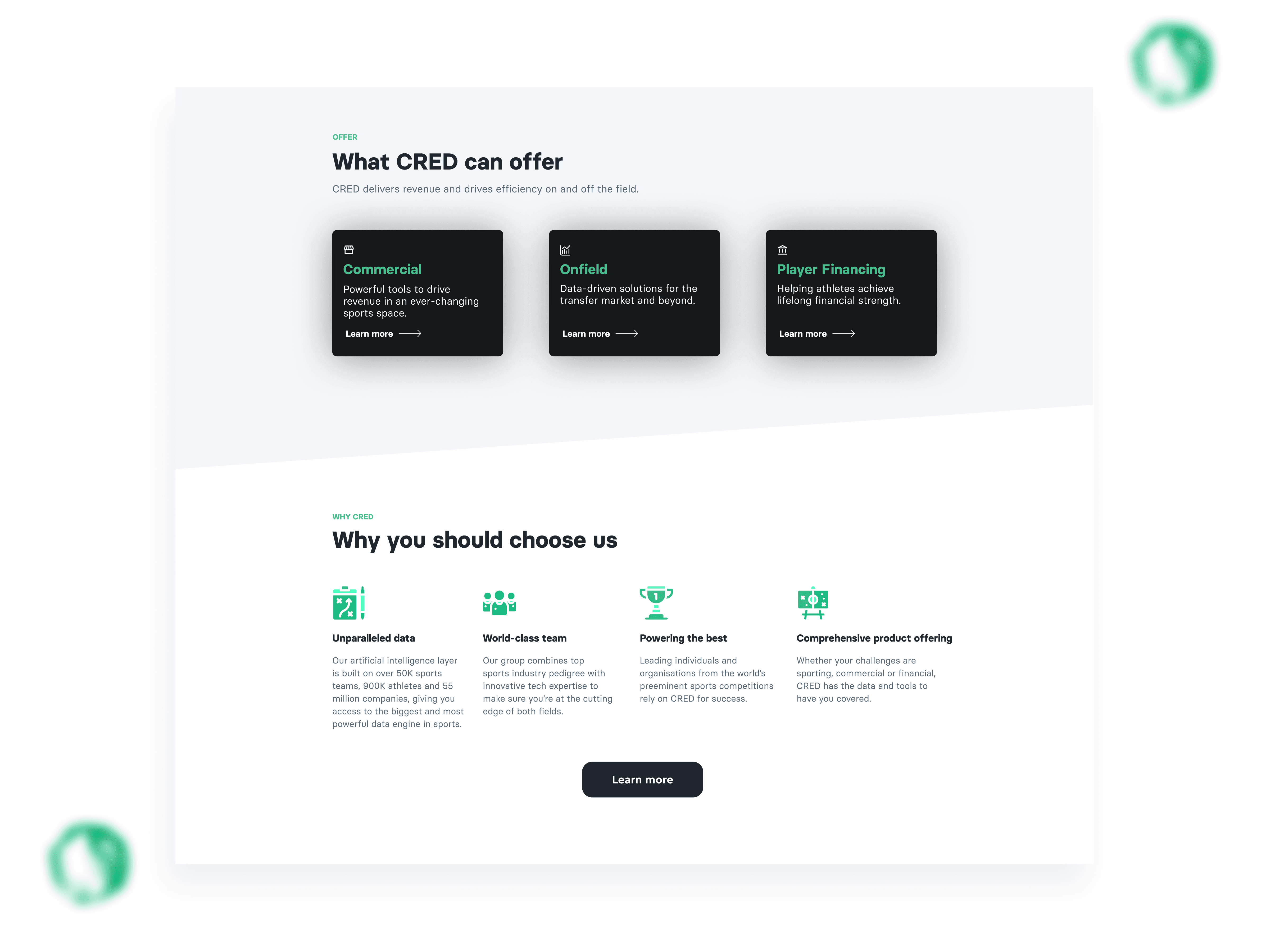
One repeatable page structure across every product: hero → who it's for → what we offer → features → get in touch, and a homepage rebuilt as the front door to all three, rather than a pitch for one.
Decision rationale
Once a visitor learns to read one product page, they can read them all: less to relearn, less cognitive load. The homepage's job changed from "sell player financing" to "show there are three products, and send you to the right one." The first screen sets what people assume CRED is, so it had to establish the full picture immediately.
Impact
The repeatable structure gave the team clean slots to add case studies, new products, and languages later, exactly what the brief had asked the design to allow for without starting over.
Modern, without losing the brand
The look had to move forward without becoming a different company.
Decision focus
Keep the green-and-black identity, and rework hierarchy, layout, the hero treatment, and the data visualisations around it.
Decision rationale
The brand still worked, so reinventing it would have added cost and friction for no real gain. The value was in clarity, not novelty, an evolution people wouldn't have to relearn.
Impact
A more current, cohesive interface that still reads unmistakably as CRED.
(06)
OUTCOMES
A Site That Finally Fit
The redesign shipped and went live as CRED's site.
Hard performance metrics weren't part of what I had access to, so the value here is structural: a clearer, more extensible site that finally did the job the business had outgrown its old one for.
CRED's growth story was finally visible
Three products, clearly presented, and for the first time, a site that matched the company it had become.
Every audience had a front door
Rights holders, brands, clubs and agencies could each find themselves in the site. No one was landing on the wrong pitch.
A system the team could build on
New products, case studies, and languages could be added to the existing structure, with no redesign required.



(07)
TESTIMONIAL
Don’t Just Take My Word For It
Raynee & Danny from CRED
“
The designer was very responsive to our needs and took the time to understand my vision for the website. She provided valuable insights and suggestions throughout the design process and was open to our feedback and ideas. The end result was a beautifully designed website that exceeded my expectations: a user-friendly, professional-looking website that truly reflects our company as a brand.



© ALL RIGHTS RESERVED
Madalina Loghin 2025
SPORTS DATA INTELLIGENCE
CRED is a data intelligence layer for sports, delivering revenue and driving efficiency on and off the field.
It began with one product (player financing) and grew into three, each for a different audience. The site still spoke for the old one.
(01)
THE PROBLEM
The Website Was Still Selling One Thing
CRED's old "homepage" was really a player-financing pitch, with a club and an about page bolted on. It read like a company with one product.
That wasn't true anymore. CRED now had three: Player Financing, Onfield, and Commercial, and Commercial alone served two opposite audiences. The brief put it plainly: "We've evolved as a company and need to update our website to reflect this."
Two things had to change:
One front door for 3 products
An overview, not a single pitch.
One message per audience
Especially in Commercial, where rights holders and brands want opposite things.
(02)
MY ROLE
Owning the Whole Picture
I led the design end-to-end. The visible work was the interface, but the real work sat underneath it. Before any UI, I reworked how the whole offer was organised: what lived where, and who each page was actually speaking to.
I was responsible for key parts of the UX groundwork and early product direction, contributing to several experience improvements:
Mapped
the full offer into a clear information architecture.
Defined
who each page speaks to, and what it leads with.
Solved
the Commercial rights-holder vs brand split.
Modernised
the UI inside the existing brand
My contribution spanned research, journey definition, and delivery in the following areas:
UX audits
Competitor benchmarking
Identified friction across onboarding and navigation, synthesised research insights, and surfaced key opportunities.
Mapping user flows
Wireframing
UI exploration
Defined early-journey flows and explored UX-to-UI directions to shape core screens.
Prototyping
Stakeholder collaboration
Built prototypes for alignment, workshops and testing, helping accelerate decisions and unify direction across teams.
Rebrand contribution
UI rollout
Contributed colour and typography proposals and applied the selected direction across key screens.
User testing
Refinement
Ran a live usability session and collaborated on further testing, refining key flows before delivery.
(04)
PROJECT CHALLENGES
Shifting priorities and conflicting stakeholder feedback
Feedback came from multiple stakeholders with competing priorities. We iterated frequently and aligned on solutions that balanced user clarity with business goals.
Mid-project brand refresh
A mid-project brand refresh introduced new colours and typography, requiring rapid realignment of the visual system through collaborative workshops.
User testing challenges
Some testing rounds produced limited insights, prompting us to refine our approach and retest key flows. When participant numbers were lower, we combined user feedback with existing research and business priorities to guide decisions.
Positive outcome
These constraints strengthened cross-functional alignment and led to a more focused, user-led early journey.
The Messy Middle
(05)
SOLUTIONS
The Commercial split
Commercial served two audiences with opposite relationships to the same data: rights holders (clubs, leagues, federations, players) who own and sell sporting attention, and brands who want to buy it. Same product, opposite jobs. The brief flagged it as unsolved: "I'm not sure the best way to do this."
Decision focus
Two separate pages, one combined page, or one page that adapts to who you are.
Key improvements
A "for right holders/for brands" toggle at the top of a single Commercial page. Same structural shell: who it's for → what we offer → features, with the content swapped per audience.
Decision rationale
Two pages would have split Commercial into two smaller-feeling products; one page for both would have read generic, clear to neither. The toggle keeps it whole and shows each audience only what's theirs.
Impact
One product, two clear doors, and a pattern that scales to a third audience without a redesign.
One system, one front door
Three technical, unfamiliar products needed to be readable fast.
Decision focus
We needed to decide how far we could reshape navigation to reflect real planning behaviour without fully overhauling the IA under engineering constraints.
Key improvements
One repeatable page structure across every product: hero → who it's for → what we offer → features → get in touch, and a homepage rebuilt as the front door to all three, rather than a pitch for one.
Decision rationale
Once a visitor learns to read one product page, they can read them all: less to relearn, less cognitive load. The homepage's job changed from "sell player financing" to "show there are three products, and send you to the right one." The first screen sets what people assume CRED is, so it had to establish the full picture immediately.
Impact
The repeatable structure gave the team clean slots to add case studies, new products, and languages later, exactly what the brief had asked the design to allow for without starting over.
Modern, without losing the brand
The look had to move forward without becoming a different company.
Decision focus
Keep the green-and-black identity, and rework hierarchy, layout, the hero treatment, and the data visualisations around it.
Decision rationale
The brand still worked, so reinventing it would have added cost and friction for no real gain. The value was in clarity, not novelty, an evolution people wouldn't have to relearn.
Impact
A more current, cohesive interface that still reads unmistakably as CRED.
Untangling the Offer
(03)
CONSTRAINTS & TRADEOFFS
Build into a half-finished system
Several pages were already designed and locked, and new product pages were briefed to follow the shape of the existing ones. The work had to extend a pattern and slot in seamlessly, not redesign what was already there.
Keep the brand
The existing identity still suited the company. A refresh, not a rebrand.
Turn detail into an overview
The brief supplied dense, feature-heavy product copy but asked the homepage to give a simple, generic overview of all three products. Shaping that into something scannable was part of the job.
Designing Inside the Lines
The process wasn’t linear. Shifting priorities, stakeholder feedback loops, and a mid-sprint brand refresh required adaptability and clear communication.
Design for what's next
Layouts had to survive European languages and leave room to add case studies later, without another redesign.
Most of the calls came from working inside real limits.
(04)
GETTING CLARITY
Who actually lands on each page, and what do they need to see in the first five seconds?
What I Needed to Get Right
What does a rights holder care about that a brand doesn't, and the other way round?
Which product earns the homepage, and which can wait a click?
How much could change before the brand stopped feeling like itself?
Before designing, the questions that shaped the work were less about screens and more about audiences and structure. The second and third questions drove everything that followed.
(06)
OUTCOMES
A Site That Finally Fit
The redesign shipped and went live as CRED's site.
Hard performance metrics weren't part of what I had access to, so the value here is structural: a clearer, more extensible site that finally did the job the business had outgrown its old one for.
CRED's growth story was finally visible
Three products, clearly presented, and for the first time, a site that matched the company it had become.
Every audience had a front door
Rights holders, brands, clubs and agencies could each find themselves in the site. No one was landing on the wrong pitch.
A system the team could build on
New products, case studies, and languages could be added to the existing structure, with no redesign required.
(07)
TESTIMONIAL
Don’t Just Take My Word for It
Raynee & Danny from CRED
“
The designer was very responsive to our needs and took the time to understand my vision for the website. She provided valuable insights and suggestions throughout the design process and was open to our feedback and ideas. The end result was a beautifully designed website that exceeded my expectations: a user-friendly, professional-looking website that truly reflects our company as a brand.
(09)
FULL CASE STUDY
Want the full breakdown?
Full case study available on request.
PROJECT INFORMATION
CLIENT
CRED
Year
2023
Contribution
UI/VISUAL DESIGN
Information Architecture
PLATFORM
DESKTOP
MOBILE
TEAM - sHOREDITCH dESIGN
Madalina Loghin - DESIGN LEAD
Dylan MacKay - sENIOR UX/UI
Bringing structure to a multi-product sports platform
Connect to Content
Add layers or components to swipe between.
© ALL RIGHTS RESERVED
Madalina Loghin 2025

Menu
BRIDEBOOK
BRIDEBOOK
SPORTS DATA INTELLIGENCE
CRED is a data intelligence layer for sports, delivering revenue and driving efficiency on and off the field.
It began with one product (player financing) and grew into three, each for a different audience. The site still spoke for the old one.
(01)
THE PROBLEM
The Website Was Still Selling One Thing
CRED's old "homepage" was really a player-financing pitch, with a club and an about page bolted on. It read like a company with one product.
That wasn't true anymore. CRED now had three: Player Financing, Onfield, and Commercial, and Commercial alone served two opposite audiences. The brief put it plainly: "We've evolved as a company and need to update our website to reflect this."
Two things had to change:
One front door for 3 products
An overview, not a single pitch.
One message per audience
Especially in Commercial, where rights holders and brands want opposite things.
(02)
MY ROLE
Owning the Whole Picture
I led the design end-to-end. The visible work was the interface, but the real work sat underneath it. Before any UI, I reworked how the whole offer was organised: what lived where, and who each page was actually speaking to.
I was responsible for key parts of the UX groundwork and early product direction, contributing to several experience improvements:
Mapped
the full offer into a clear information architecture.
Defined
who each page speaks to, and what it leads with.
Solved
the Commercial rights-holder vs brand split.
Modernised
the UI inside the existing brand
My contribution spanned research, journey definition, and delivery in the following areas:
UX audits
Competitor benchmarking
Identified friction across onboarding and navigation, synthesised research insights, and surfaced key opportunities.
Mapping user flows
Wireframing
UI exploration
Defined early-journey flows and explored UX-to-UI directions to shape core screens.
Prototyping
Stakeholder collaboration
Built prototypes for alignment, workshops and testing, helping accelerate decisions and unify direction across teams.
Rebrand contribution
UI rollout
Contributed colour and typography proposals and applied the selected direction across key screens.
User testing
Refinement
Ran a live usability session and collaborated on further testing, refining key flows before delivery.
The process wasn’t linear. Shifting priorities, stakeholder feedback loops, and a mid-sprint brand refresh required adaptability and clear communication.
(04)
PROJECT CHALLENGES
Shifting priorities and conflicting stakeholder feedback
Feedback came from multiple stakeholders with competing priorities. We iterated frequently and aligned on solutions that balanced user clarity with business goals.
Mid-project brand refresh
A mid-project brand refresh introduced new colours and typography, requiring rapid realignment of the visual system through collaborative workshops.
User testing challenges
Some testing rounds produced limited insights, prompting us to refine our approach and retest key flows. When participant numbers were lower, we combined user feedback with existing research and business priorities to guide decisions.
Positive outcome
These constraints strengthened cross-functional alignment and led to a more focused, user-led early journey.
The Messy Middle
(03)
CONSTRAINTS & TRADEOFFS
Build into a half-finished system
Several pages were already designed and locked, and new product pages were briefed to follow the shape of the existing ones. The work had to extend a pattern and slot in seamlessly, not redesign what was already there.
Keep the brand
The existing identity still suited the company. A refresh, not a rebrand.
Turn detail into an overview
The brief supplied dense, feature-heavy product copy but asked the homepage to give a simple, generic overview of all three products. Shaping that into something scannable was part of the job.
Designing Inside the Lines
Most of the calls came from working inside real limits.
Design for what's next
Layouts had to survive European languages and leave room to add case studies later, without another redesign.
(04)
GETTING CLARITY
Who actually lands on each page, and what do they need to see in the first five seconds?
What I Needed to Get Right
What does a rights holder care about that a brand doesn't, and the other way round?
Which product earns the homepage, and which can wait a click?
How much could change before the brand stopped feeling like itself?
Before designing, the questions that shaped the work were less about screens and more about audiences and structure. The second and third questions drove everything that followed.
(05)
SOLUTIONS
Untangling the Offer
The Commercial split
Commercial served two audiences with opposite relationships to the same data: rights holders (clubs, leagues, federations, players) who own and sell sporting attention, and brands who want to buy it. Same product, opposite jobs. The brief flagged it as unsolved: "I'm not sure the best way to do this."
Decision focus
Two separate pages, one combined page, or one page that adapts to who you are.
Key improvements
A "for right holders/for brands" toggle at the top of a single Commercial page. Same structural shell: who it's for → what we offer → features, with the content swapped per audience.
Impact
One product, two clear doors, and a pattern that scales to a third audience without a redesign.
Decision rationale
Two pages would have split Commercial into two smaller-feeling products; one page for both would have read generic, clear to neither. The toggle keeps it whole and shows each audience only what's theirs.
Timely Touchpoints That Drive Supplier Discovery
We introduced smarter, more contextual entry points to the supplier marketplace, based on where each couple was in their planning journey.
Key improvements
Designed tailored experiences for key moments (e.g. “venue booked” vs. “just getting started”)
Created smarter prompts and supplier cards that felt timely and helpful
Surface suppliers based on real planning behaviours, not just categories
Impact
By making supplier discovery feel more relevant and well-timed, we increased engagement with non-venue services, bringing users deeper into the product and closer to Bridebook’s business goals.
One system, one front door
Three technical, unfamiliar products needed to be readable fast.
Decision focus
We needed to decide how far we could reshape navigation to reflect real planning behaviour without fully overhauling the IA under engineering constraints.
Key improvements
One repeatable page structure across every product: hero → who it's for → what we offer → features → get in touch, and a homepage rebuilt as the front door to all three, rather than a pitch for one.
Impact
The repeatable structure gave the team clean slots to add case studies, new products, and languages later, exactly what the brief had asked the design to allow for without starting over.
Decision rationale
Once a visitor learns to read one product page, they can read them all: less to relearn, less cognitive load. The homepage's job changed from "sell player financing" to "show there are three products, and send you to the right one." The first screen sets what people assume CRED is, so it had to establish the full picture immediately.
Modern, without losing the brand
The look had to move forward without becoming a different company.
Decision focus
Keep the green-and-black identity, and rework hierarchy, layout, the hero treatment, and the data visualisations around it.
Key improvements
Introduced a warmer primary colour and refined supporting palette
Updated typography for improved readability and hierarchy
Rolled out the visual direction across onboarding, homepage, and navigation
Impact
A more current, cohesive interface that still reads unmistakably as CRED.
Decision rationale
The brand still worked, so reinventing it would have added cost and friction for no real gain. The value was in clarity, not novelty, an evolution people wouldn't have to relearn.
(06)
OUTCOMES
A Site That Finally Fit
The redesign shipped and went live as CRED's site.
Hard performance metrics weren't part of what I had access to, so the value here is structural: a clearer, more extensible site that finally did the job the business had outgrown its old
one for.
CRED's growth story was finally visible
Three products, clearly presented, and for the first time, a site that matched the company it had become.
Every audience had a front door
Rights holders, brands, clubs and agencies could each find themselves in the site. No one was landing on the wrong pitch.
A system the team could build on
New products, case studies, and languages could be added to the existing structure, with no redesign required.
(07)
TESTIMONIAL
Don’t Just Take My Word For It
Raynee & Danny from CRED
“
The designer was very responsive to our needs and took the time to understand my vision for the website. She provided valuable insights and suggestions throughout the design process and was open to our feedback and ideas. The end result was a beautifully designed website that exceeded my expectations: a user-friendly, professional-looking website that truly reflects our company as a brand.
(09)
FULL CASE STUDY
Want the full breakdown?
Full case study available on request.
PROJECT INFORMATION
Year
2023
CLIENT
CRED
Contribution
UI/VISUAL DESIGN
Information Architecture
PLATFORM
DESKTOP
MOBILE
TEAM - sHOREDITCH dESIGN
Madalina Loghin - DESIGN LEAD
Dylan MacKay - sENIOR UX/UI
Bringing structure to a multi-product sports platform
CRED
CRED

© ALL RIGHTS RESERVED
Madalina Loghin 2025